The Problem
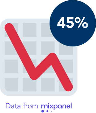
Premium members are a key revenue driver for the business, so providing an enhanced experience that serves their credit needs is essential. However according to Mixpanel, 45% of premium users are cancelling their subscription before renewal. This puts the business at risk of losing potential long-term customers.
How can we add value to the premium experience to increase membership engagement and retention?
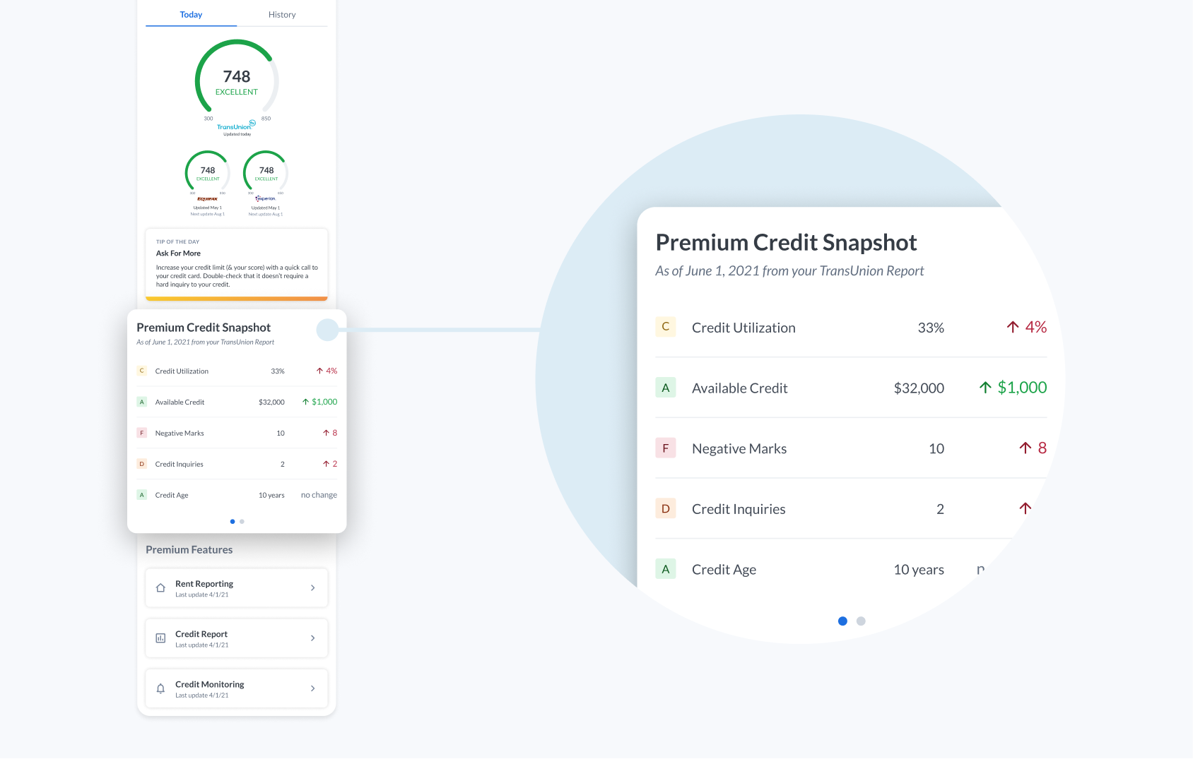
Through Mixpanel, it was identified that Credit Snapshot was a feature users commonly interact with first when visiting the platform. Based on this positive indicator of user interest and our persona for premium users, we decided to focus improvements on this feature first as it could have the largest user impact in the shortest amount of time.
Research
Learning about the users
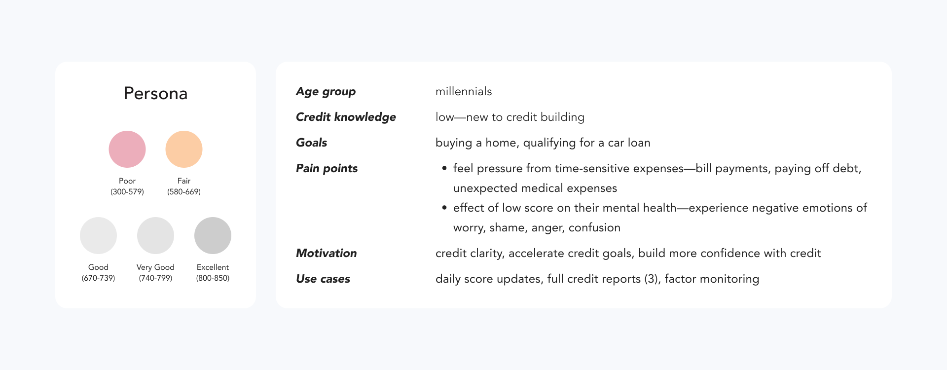
To learn about our target audience—premium users—and form a better idea about their motivations and needs, I referenced a persona deck shared by the UX Researcher.
The competitive landscape
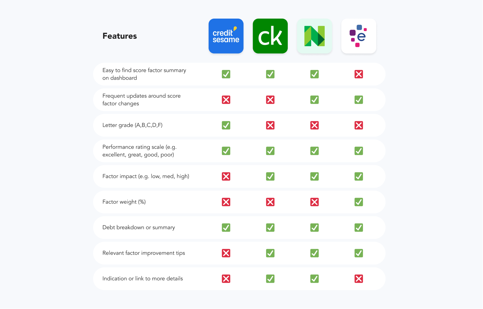
Understanding how we stacked in the market against competitors was important in identifying gaps and opportunities for improvements.
Key Findings
- Competitors displayed significant factor information—impact level, weight, relevant improvement tips—directly on their dashboard, while this information was only accessible within Credit Snapshot’s subpages.
- Competitors had better usability—clearly labelled links to pages.
- NerdWallet had frequent updates around score factor changes.
Solution
Customers should have easy access to all significant information and a clear breakdown of their credit activity, in order to make informed decisions.
Currently, factors with no changes are reflected with a “no change” status. However, Snapshot should communicate this in more meaningful ways that provides more context.
To provide customers with more control of how they monitor and view factors, and accommodate for individual viewing preferences around specific factors.
Explorations
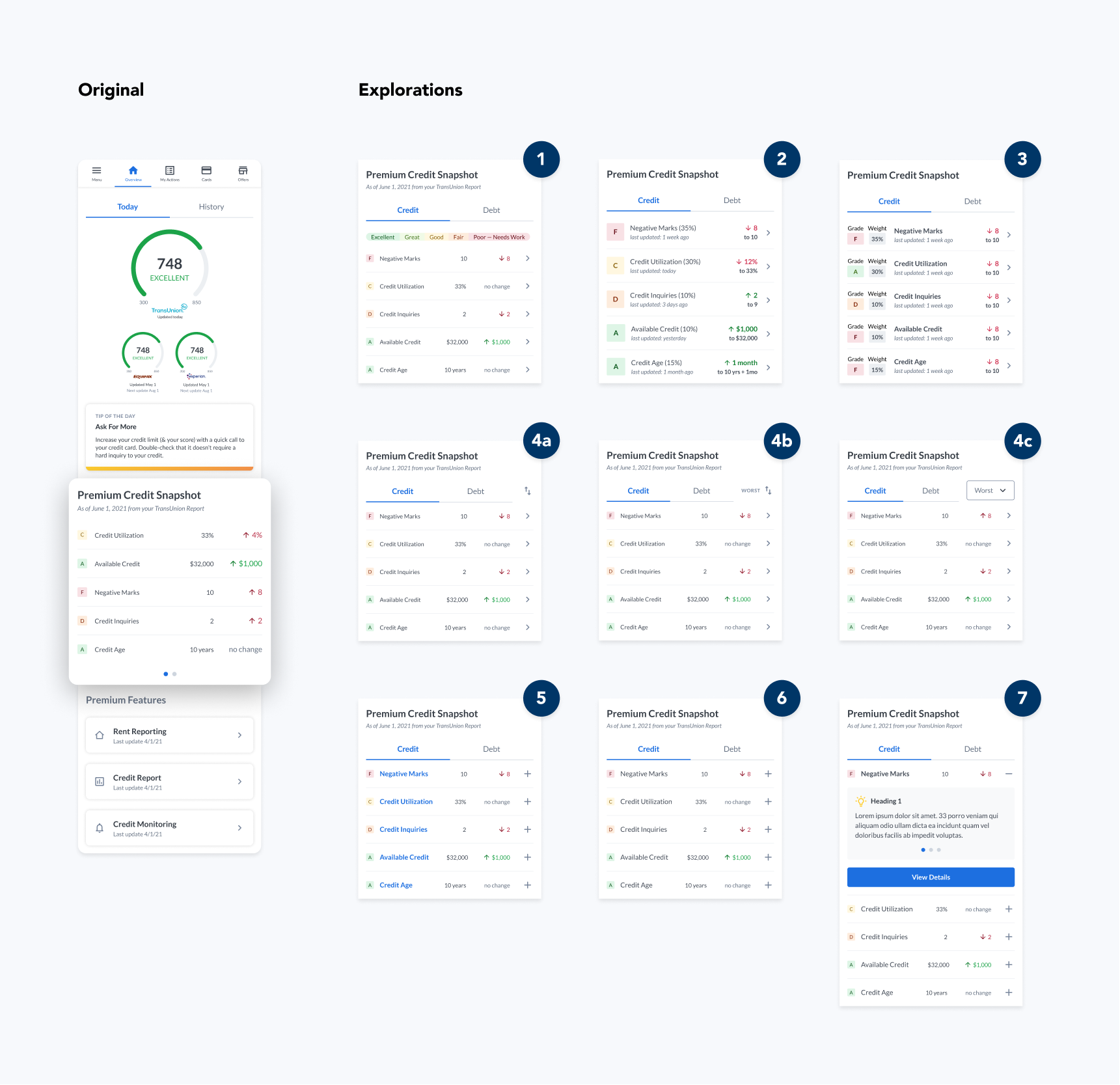
One of the biggest design challenges for the mobile experience was learning how to best convey complex information in a smaller form factor to make it easy and clear to understand. With a lot of ideas and limited space, I started with a breadth of different concepts to first get a sense of the direction we wanted to go.
Design Decisions
- Displayed factor weight — improve information accessibility to contextually significant information (i.e. weight percentage) previously hidden on subpages. [#2-3]
- Relocated tip cards — optimize its inherent value, as low-scoring factors on Credit Snapshot may prompt users to seek out relevant credit improvement strategies. Also optimizes screen real-estate for mobile viewing. [#7]
- Added individual factor updates — reflect notable changes of each factor separately and remove meaningless information (i.e. “no change” status). [#2-3]
- Added sort function — allow users more control of their monitoring experience. [#4a-c]
- Credit / Debt Headings — more clarity on section content compared to a carousel. [all]
- Chevron, Collapse, and Expand Icons — improve communication with users by including familiar design patterns that indicate more information available. [all]
The PM wanted to include everything we were short on compared to our competitors, including factor impact terminology (high-, medium-, low-impact) and factor weight (%). However, I felt it was unnecessary to display both as they shared similar meanings and so would be redundant. Given the limited space, I was able to convince them to go with just factor weight as it would be compact enough to fit alongside other information, and was more factually-based and less vague than factor impact.
Iterations
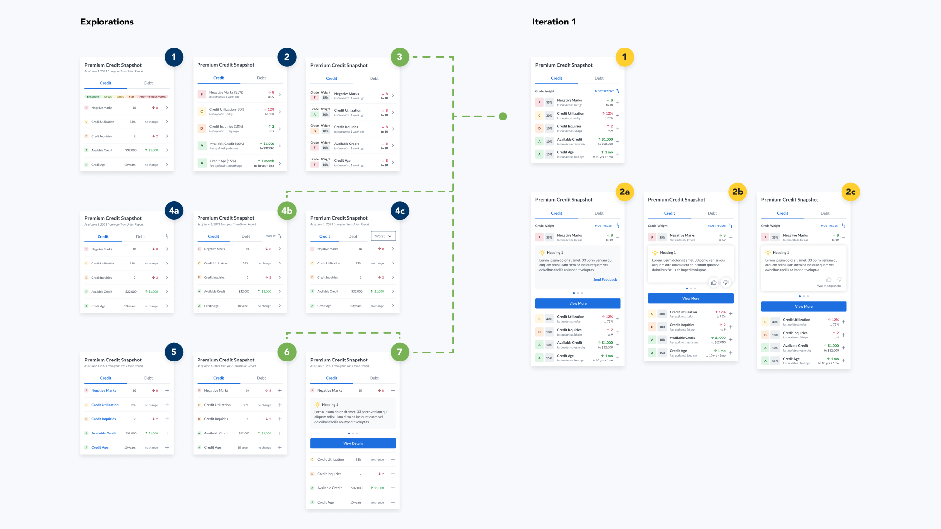
Sharing my explorations with the PM and Engineers, I continued iterating on factor weight to find a more optimal way of displaying the information. I also explored new concepts around rating factor tips, which we discussed could be an adequate way to facilitate feedback and interaction from users.
Design Decisions
- Factor Weight — refined to a single heading to remove repetition.
- Thumbs-Up/Down Rating System — potentially increase engagement by allowing in-app feedback on the usefulness of factor tips.
To avoid making Credit Snapshot too complex, I wanted to remove any non-core functionalities, such as the sort function. I felt it wasn't necessary as all 5 factors were visible at a glance. As the PM insisted we keep it for more engagement—despite it not being a core function—I brought up possible benefits of removing sort.
- Design — removes effort required from users, and keeps the interface simpler especially with limited space.
- Engineering — reduces implementation effort.
- Product — minimal additional value for the amount of implementation effort required, particularly if we set the default sorting to the best option to begin with i.e. based on how most people would intuitively sort factors.
They agreed to remove it as it wouldn’t impact the product greatly, and after confirming with the Engineers that it was possible, we decided to have the default sort be multi-level—sorting from worst to best grade first, followed by most to least weighted.
Thumb vs. Star: Which rating system to use?
Nearing the end of my sprint, I shared iterations with the larger design team, and received a suggestion to try a star-rating system to rate tip cards, as this was a pattern that already existed in our design system. I wasn't sure which to go with, so I decided to A/B test both.

A/B Testing
Over 2 weeks, two concept (thumb vs. star) designs were tested as an experiment on Mixpanel alongside the original. We were interested in seeing if there was an improvement in engagement and retention, and assigned ~10% of premium users to each test group.
Result and Impact
- Larger interaction with either concepts—compared to the original.
- Slightly larger interaction with the Star-rating compared Thumb-rating
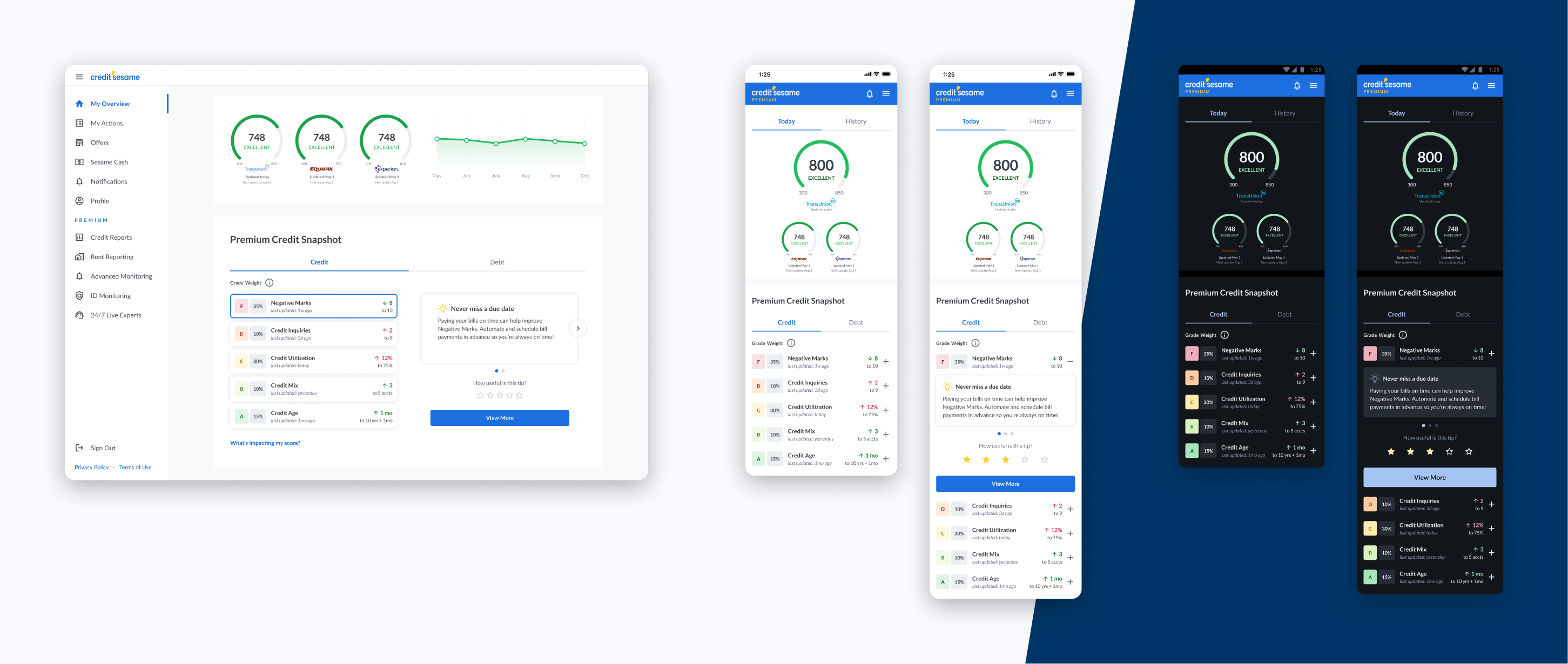
- Conclusion — there was a positive impact overall on engagement, so we decided to go with the Star-rating in the final design.
I was unable to determine if there was a significant effect on retention in just 2 weeks, which was when I last kept updated on this project. Measuring retention rates over a longer period of at least a month, through feedback methods like in-app questionnaires or surveys, could be helpful in this case.
Final Design
Prototype
The new Credit Snapshot, including how I envisioned the Debt tab to look.
Learnings
- A/B test with different user samples + over a longer period of time, to more accurately confirm the impact on engagement and retention is due to the improvements and not novelty.
- Gather more qualitative data from users to validate the impact the solution had (if any) in improving their experience with premium.