The Problem
Wing's mobile app is a key touchpoint for customers to manage their account and phone plan on-the-go. According to survey data (ROI Rocket), customers are dissatisfied with the app experience:
- 82% found a lack of clarity on when payments are due
- 77% found difficulty in tracking data usage
Problem Statement
Wing customers need a more effective way to track their data usage and pay their bills, in order to better monitor / manage their phone plan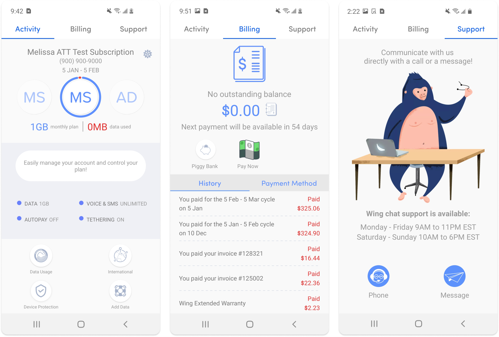
Research
I approached this problem by focusing first on the customer's experience. To accurately narrow down pain points, I conducted research through different channels — interviewing customer service, sending out an instagram survey, and exploring app reviews.
Interviews
Working alongside the other designer, we interviewed 5 Wing customer service agents on customers' experience around data usage and billing. I lead 2 sessions, while the other designer lead 3.
Key Findings
- Too many steps to check their outstanding balance, due date, and to pay their bills
- Difficulty finding data usage information due to it blending in too much with everything else on the home screen
- General difficulty navigating the interface efficiently
- Can't see balance upfront
Customer app reviews
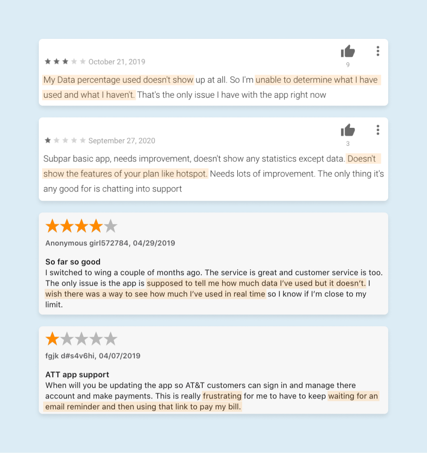
My second source for pain points and feedback was customer reviews on the Google Play and App Store. What I found was that many customers had difficulty viewing their data usage and plan features, and had frustrations around the bill payment process.
Instagram survey
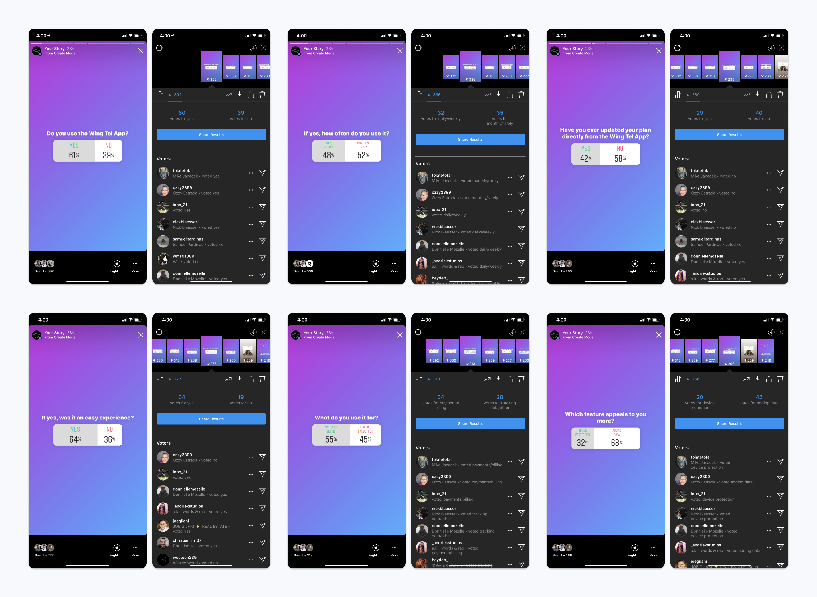
Lastly, I reached out to marketing to send a survey to customers on Instagram for more real-time data on user behaviour, preferences, and general usage on the app.
Key Findings
- Customer usage — 55% Payments / Billing, 45% Tracking Data / Other.
- Features customers value — 68% Adding Data, 32% Device Protection.
Affinity Map
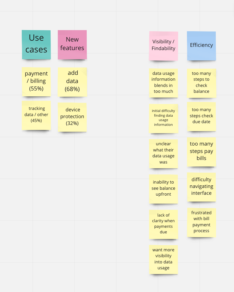
From the collective research, I synthesized the data into an affinity map to identify any themes. Two common themes I found and decided to base my solution on were:
- Visibility / Findability
- Efficiency
Market research
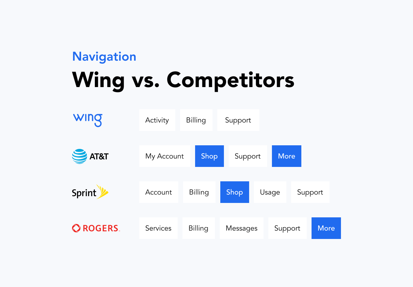
While auditing the app, I wanted to know how some of Wing’s competitors organized and named their navigation in comparison. Conducting a quick search on the competitors' app, I found they all used a bottom navigation.
Key Findings
- AT&T and Rogers had a “More” page in their navigation for account settings and preferences.
- AT&T and Sprint had a “Shop” page, which could be useful for Wing who also sells devices and accessories.
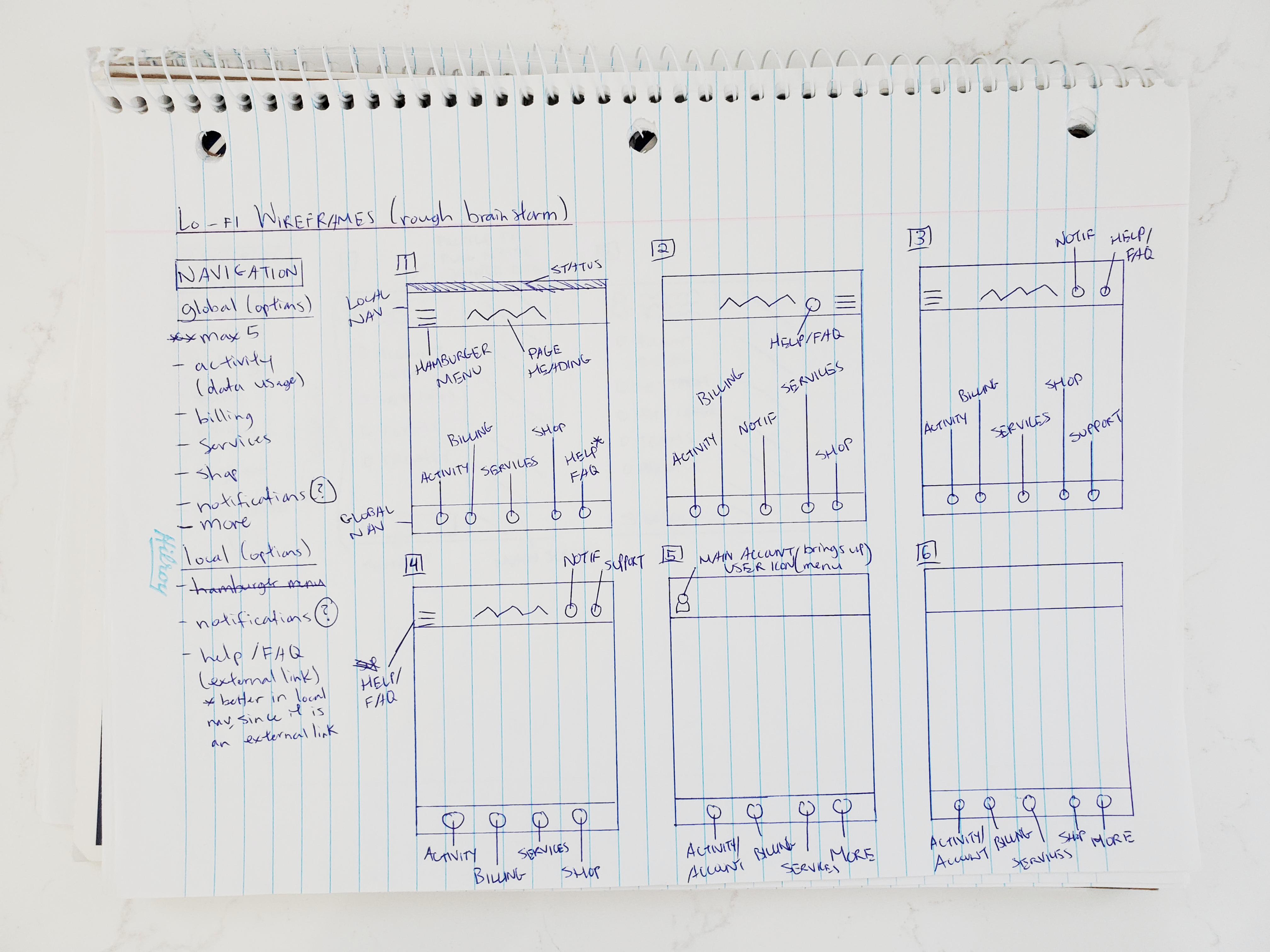
Through this process, I found Wing’s top navigation was not ideal for the common user, based on a thumb-driven design where 49% of users hold their mobile device with one hand. This means the bottom half of the screen is ideal for anything requiring user interaction, as it is more easily reachable with the thumb. Thus, I proposed a bottom navigation in my sketches.
Design
Sketching ideas
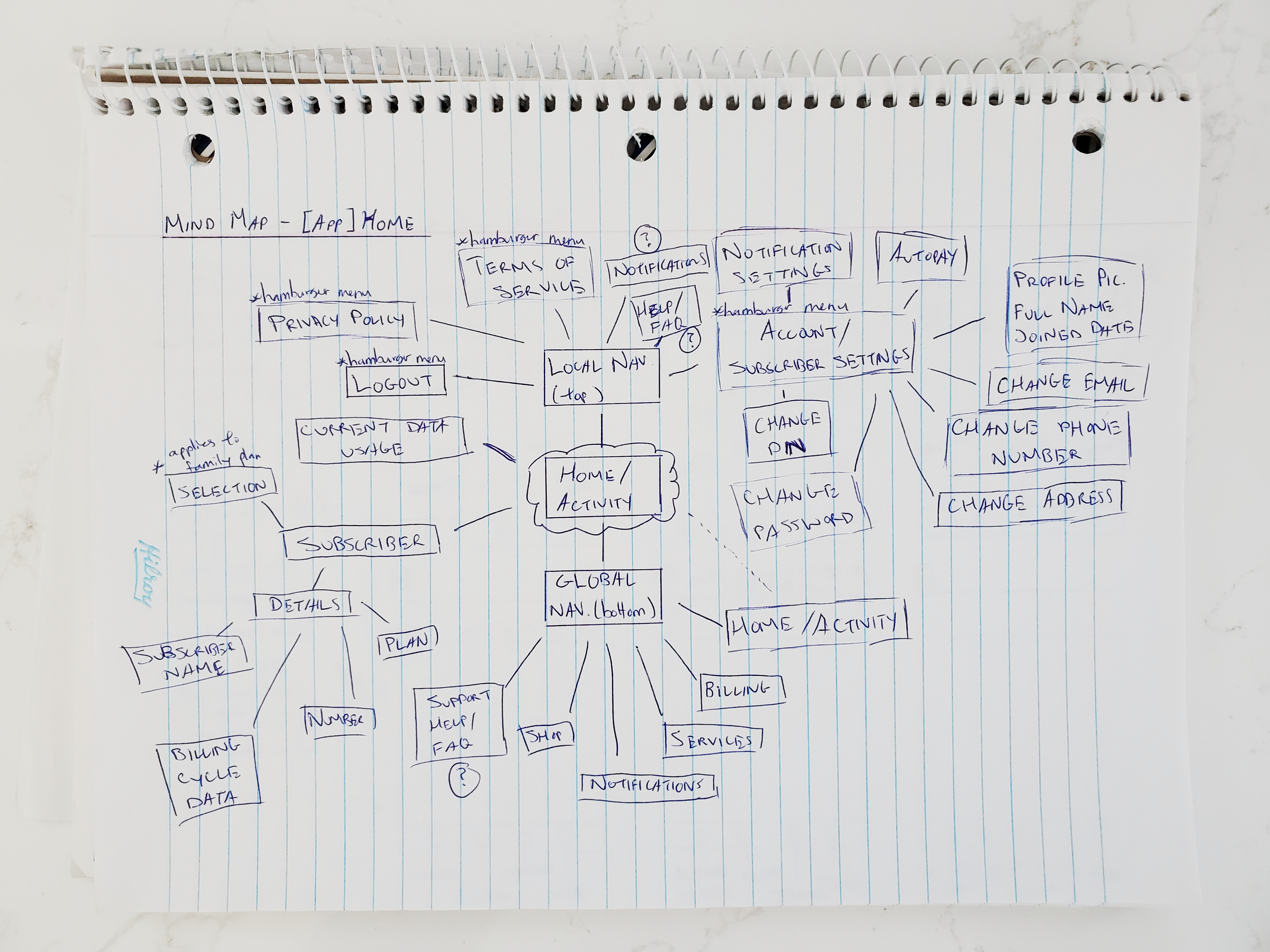
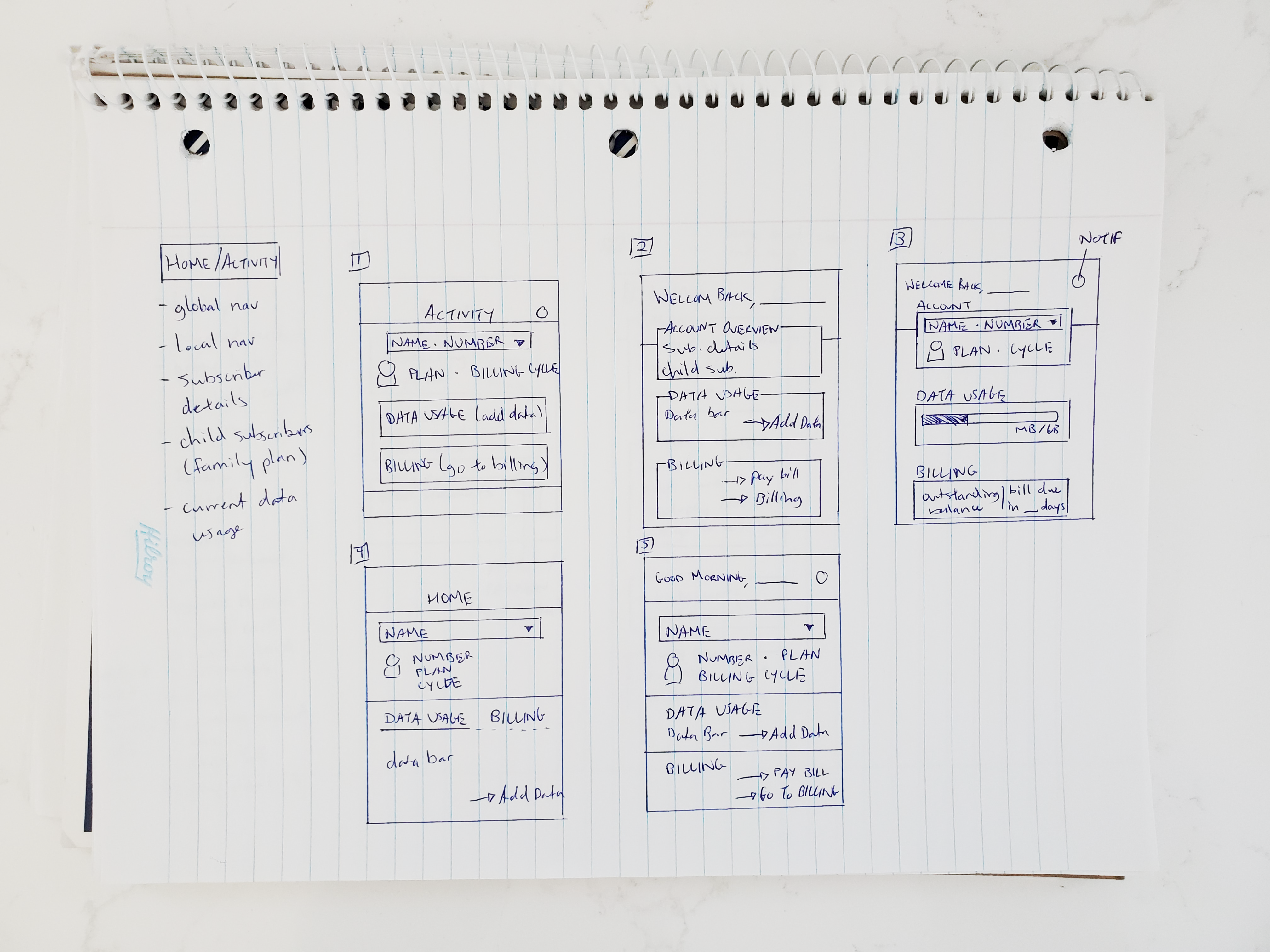
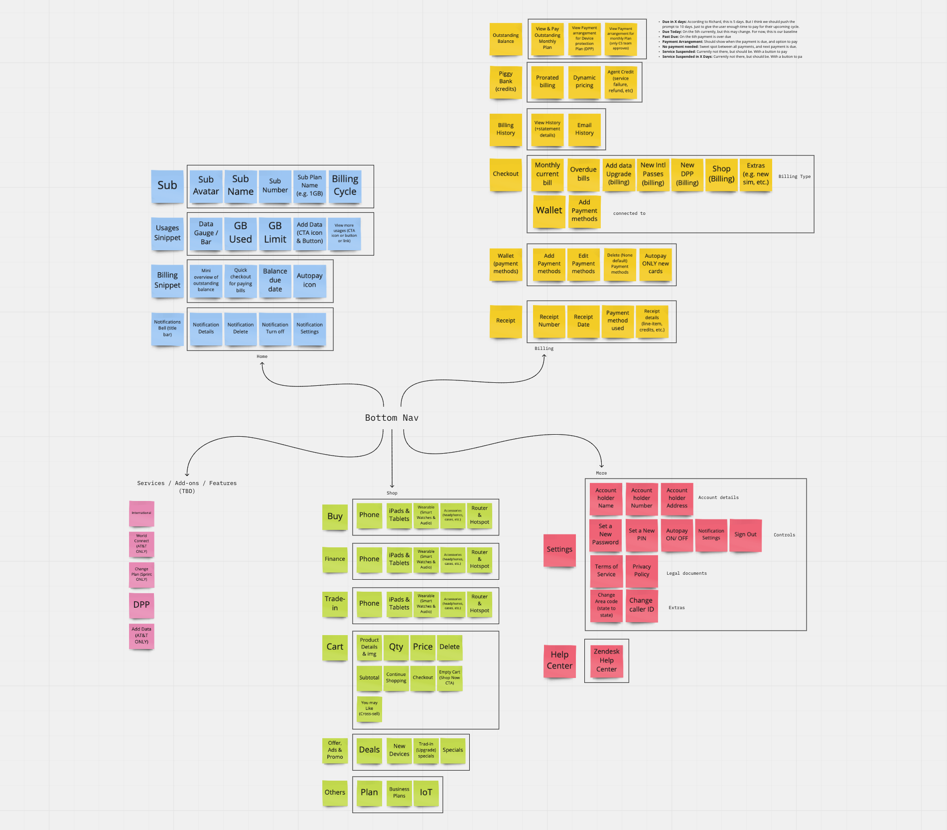
I started ideating by sketching a mind map of the home screen to see how the pages and features could be connected. At the same time, I brainstormed ideas for the navigation and home screen based off research. Presenting my sketches to the team, we collaborated on a broader map of the app’s architecture and content on Miro. This helped us visualize how each item could be categorized.
Wireframing
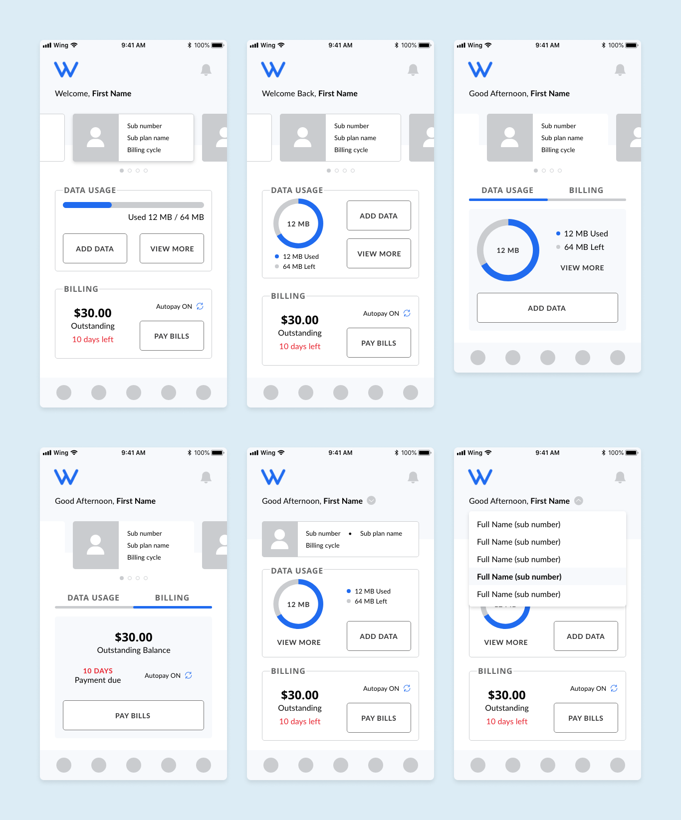
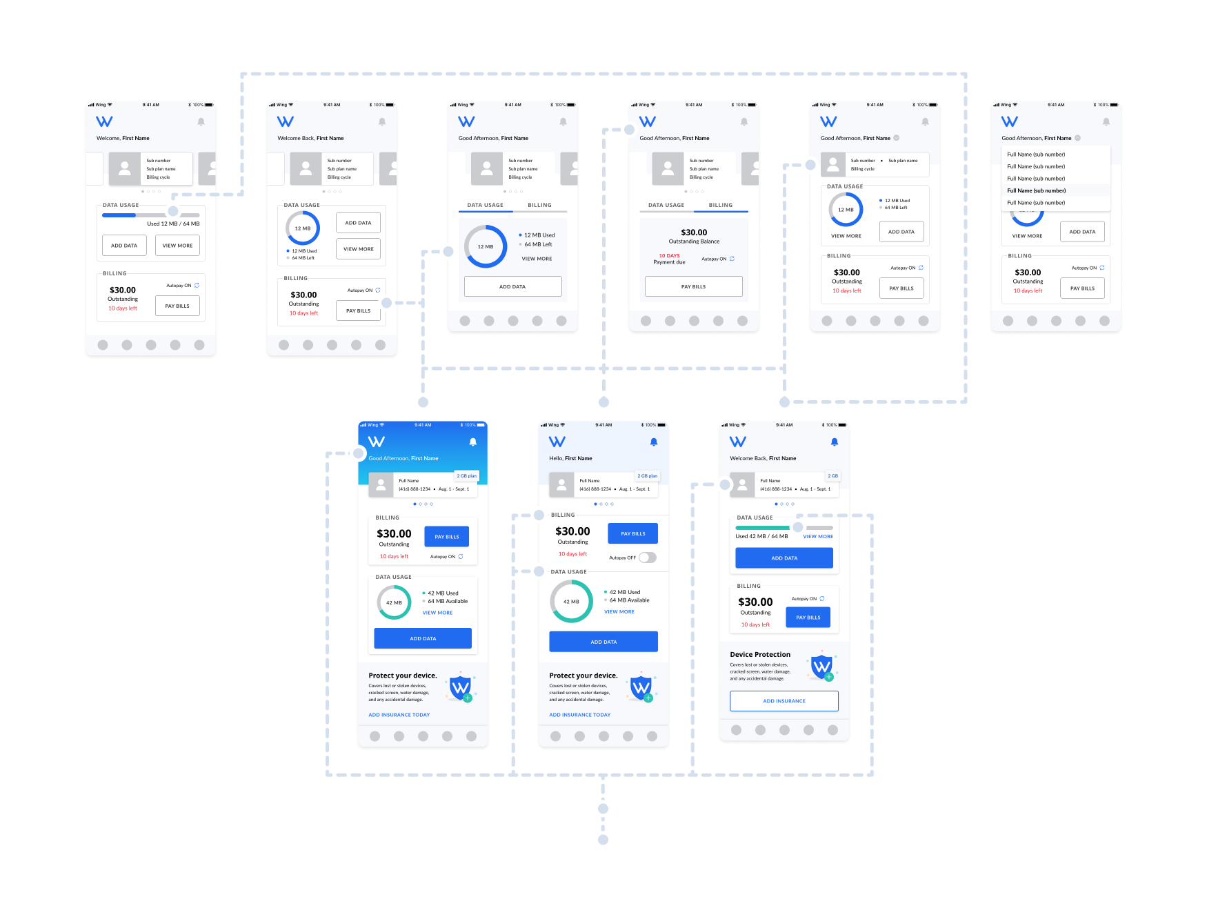
Incorporating ideas from the brainstorming session with my sketches, I created low-fidelity wireframes on the home screen layout. As we were still in the ideation stage, I wanted to focus on the layout and navigation separately.
Explorations
- Welcome Greeting — adds a humanistic element to the app.
- Top Header — clearer visual hierarchy by creating a distinction between the subscriber selector and the subscriber-dependent information (data usage and billing).
- Individual / Tab Snippet Sections — quicker access to essential features and information; contributes to more defined visual hierarchy and structure
- Carousal Card / Drop-down Subscriber Selector — two scalable design patterns that accommodate individual and family plans. Carousal allows for quicker user selection, while drop-downs require less screen real-estate.
- Visuals — quicker interpretation of data.
Iterations
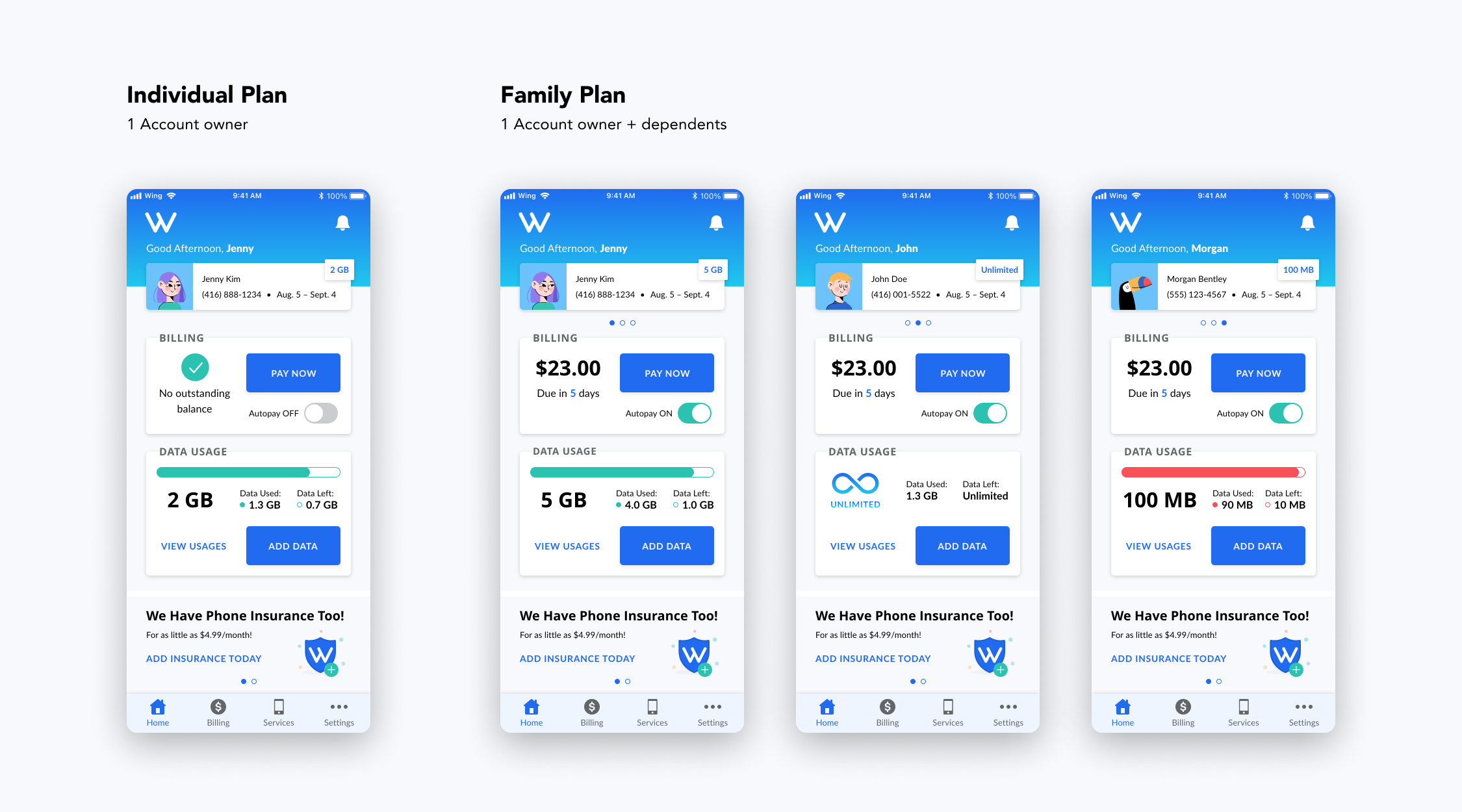
I presented various design options to the other designers, product manager, engineers, and leadership to get feedback on the approach and ensure it supported the user experience, aligned with business goals and the web dashboard, and did not have any development limitations. After several iterations, I created final designs for both individual and family plan.
Design Decisions
- Carousal Card — quicker user selection; more variety of interaction with one swiping motion (compared to multiple taps with a drop-down); more visual hierarchy and clarity on whose information the user is viewing.
- Individual Billing / Usage Section — more high-level visibility into both sections. As research showed 55% users used app for bill payments and 45% for tracking data, I decided to place the Billing section first.
Final Design
What I Learned
To work with the resources you have
One of the biggest challenges I faced was the research and testing constraints, due to lack of buy-in from leadership. Although it wasn't the most ideal situation, it motivated me to think outside the box for alternative methods to better understand the user (app reviews, customer support agents, surveys).