Introduction
In 2020, Wing’s design team experienced a lot of growth—from just myself and a product manager to an additional 3 product designers and a graphic designer. As we began working on a number of different projects, we inevitably found inconsistencies across our designs. If left unchecked, this lack of cohesion would negatively impact Wing's visual identity and the users’ overall experience with Wing’s products. Realizing we needed a central source for aligning styles, components, and guidelines across our designs, we started developing Wing’s first design system.
My role on this project focused on auditing existing styles across Wing’s applications, researching design system best practices, and building reusable components and guidelines alongside 3 other designers.
Our Goals
- Establish reusable styles and components, with a focus on cross-platform consistency, efficiency, and scalability
- Reduce overall design debt on our projects

The Approach
Conduct a UI audit
My first step was to conduct a UI audit to identify areas of inconsistencies. During the creation of our system, I was also working on the Wing App project, so I focused on compiling and recording existing styles and components used on Wing’s mobile app.
Research best practices
Alongside the other designers, I researched best practices for building design systems—i.e. responsive scaling, UI spacing, grid systems, accessible colors, type, and more. During this period, I communicated with the CEO on his vision for the Wing style guide rebrand.
Creating the building blocks
From the different styles and components collected across Wing’s website, mobile app, and web dashboard, I discussed with the other designers whether we would keep or change specific styles across color and type.
Assembling our pattern library
As a team, we assessed both current and potential use cases to determine the most optimal design for states and variants, which helped to ensure we were building reusable, scalable components. Using established styles, I created an array of these components—buttons, form fields, and app and web components—along with their different states and variants.
Throughout the process, I communicated consistently with the other designers to ensure we were on the same page on component iterations, usage guidelines, and overall decision-making.
Foundation
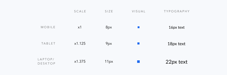
Following Atomic Design guidelines, we mapped out our base elements first—scale, spacing, and grid system for various screen sizes. This would help us to build an organized design layout that scaled across devices. Using a modular scale, we decided on a ratio that we could apply to our base size of 8px, which we found was an easy number that could scale to more whole numbers.
Spacing
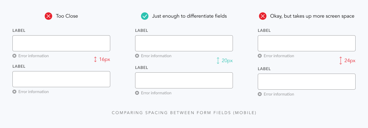
Our guidelines on spacing between UI elements was any multiple of 8px, our base size. On which multiple to use, we agreed to leave the decision up to the designer’s best judgement on their situation, unless it applied cross-platform. For example, we found a 20px spacing between form fields on mobile to be the best after comparing it with whole-number multiples of 16px and 24px. This was especially the case for error form fields.
Responsive Grid System
For our grid system, we adopted similar guidelines to Google Material Design’s guides on responsive grid layouts — 4-column, 6-column, and 12-column grids for mobile, tablet, and laptop/desktop screen sizes respectively. Through Google Analytics, we also took into consideration which devices were most used by our customer base to view Wing’s website, which helped us decide which specific devices to design for.
- iPhone 8 (375 x 667) — Column: 60px / Margin: 30px / Gutter: 25px
- iPhone 11 (414 x 896) — Column: 70px / Margin: 28px / Gutter: 26px
- Galaxy s10 (360 x 760) — Column: 58px / Margin: 28px / Gutter: 24px
- iPad Mini (768 x 1024) — Column: 97px / Margin: 30px / Gutter: 25px
- MacBook Pro (1280 x 800) — Column: 70px / Margin: 55px / Gutter: 30px
- Desktop (1920 x 1080) — Column: 120px / Margin: 75px / Gutter: 30px

Colors
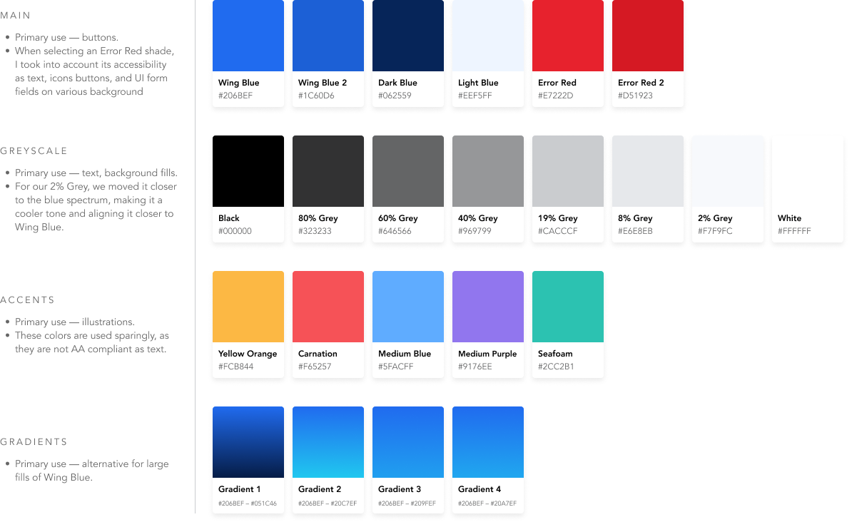
Wing’s initial color palette included black, white, a few greys, a signature blue (#206BEF), and a red and green that did not pass accessibility. Working with the existing colors, we created a palette that included a group of frequently used colors (e.g. Wing Blue and Error Red), a greyscale, accents, and gradients.
Typography
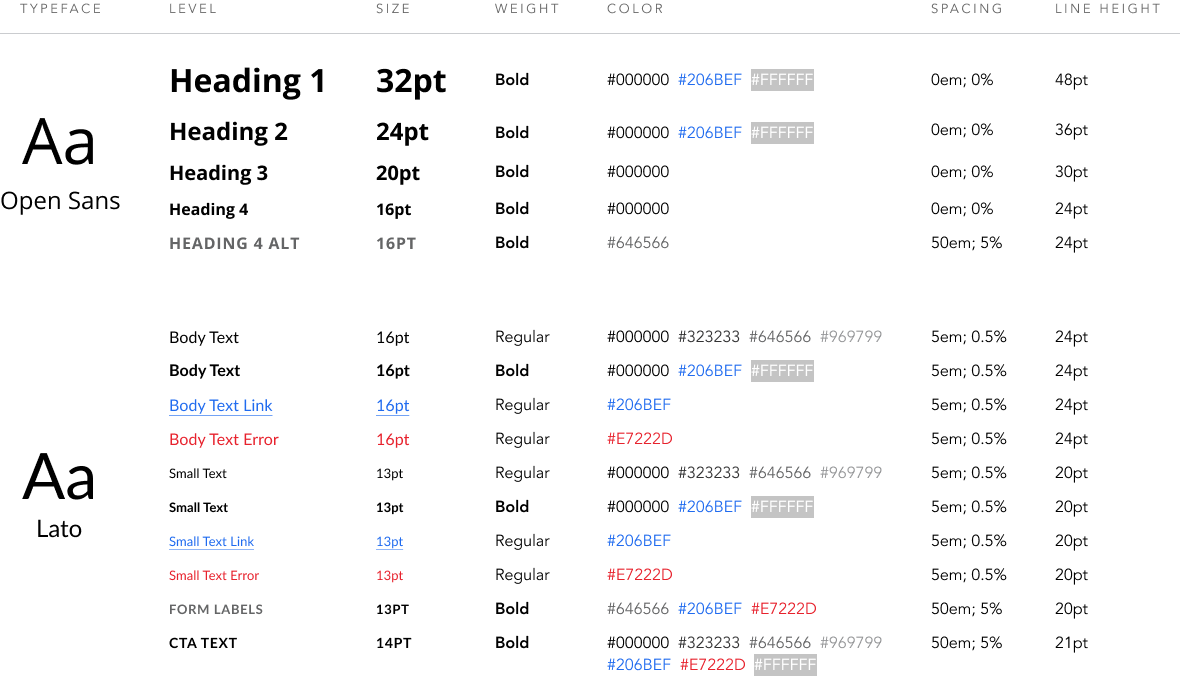
We selected two sans-serif fonts (one for heading, one for body text) to complement Wing’s brand identity — a more modern, digital-first company. We put together the mobile typography first as the base size, before scaling upwards for tablet, laptop, and desktop screen sizes.
How we organize our typography
To keep our typography organized internally, we followed a logical naming format to help make searching for specific character styles easier:
ScreenSizeInitial-Level[.FontWeight/State][.#HexColor]
- Screen Size Initial — m- / t- / l- / d-
- Level — h1 / h2 / h3 / h4 / p.basic / p.small / formlabel / cta
- Font Weight or State (if applicable) — .bold / .link / .error
- #Hex Color (if applicable) — .#206BEF / .#FFFFFF / .#969799 / .#323233 / .#646566 / .#E7222D
Buttons
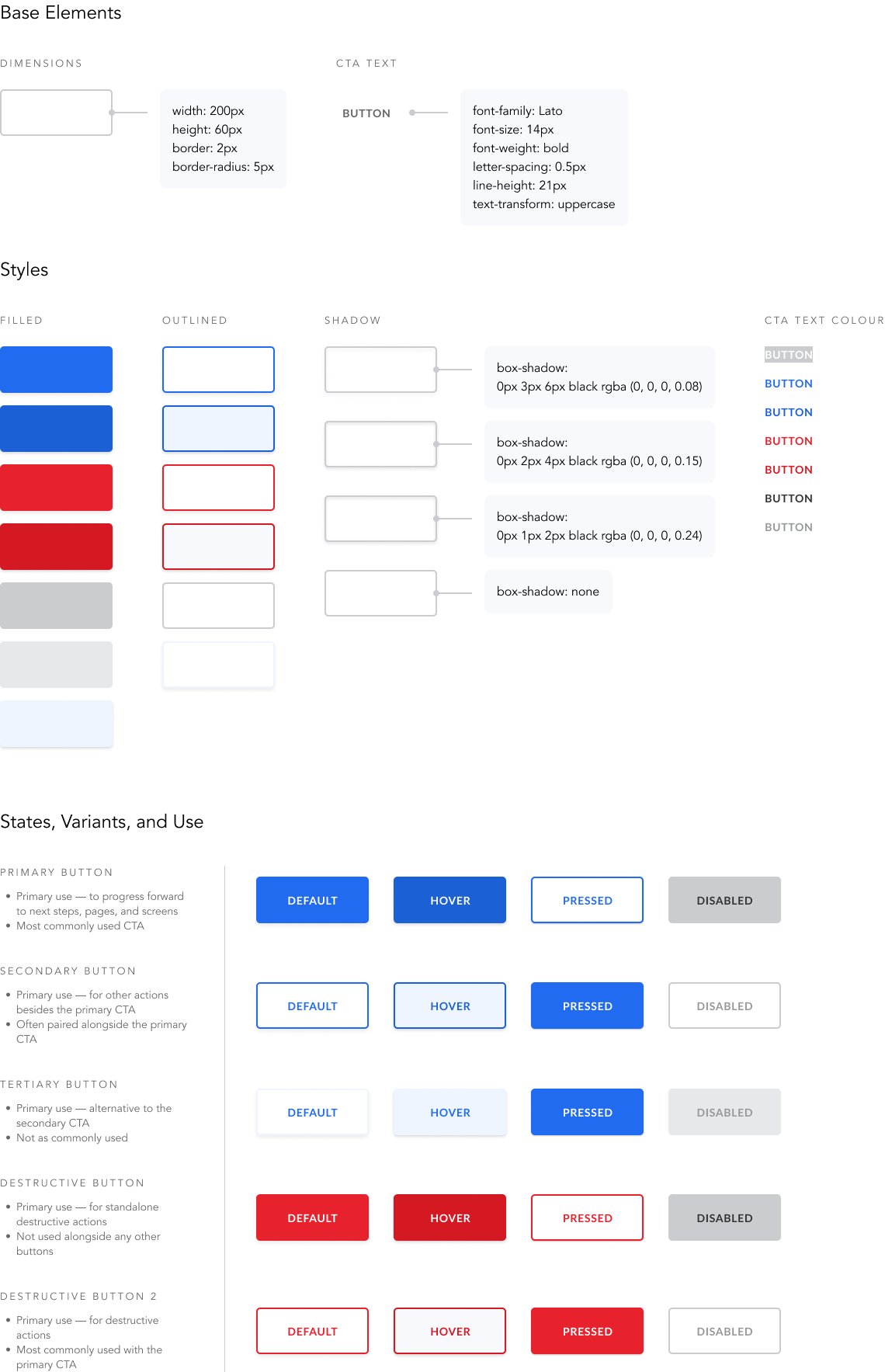
Our buttons are built off of the signature blue button which existed on the Wing website. We created different states and variants of the button to use in various scenarios. When scaling our buttons for tablet, laptop, and desktop, we used our mobile button size (iPhone 8) as a base.
Form & Input Fields
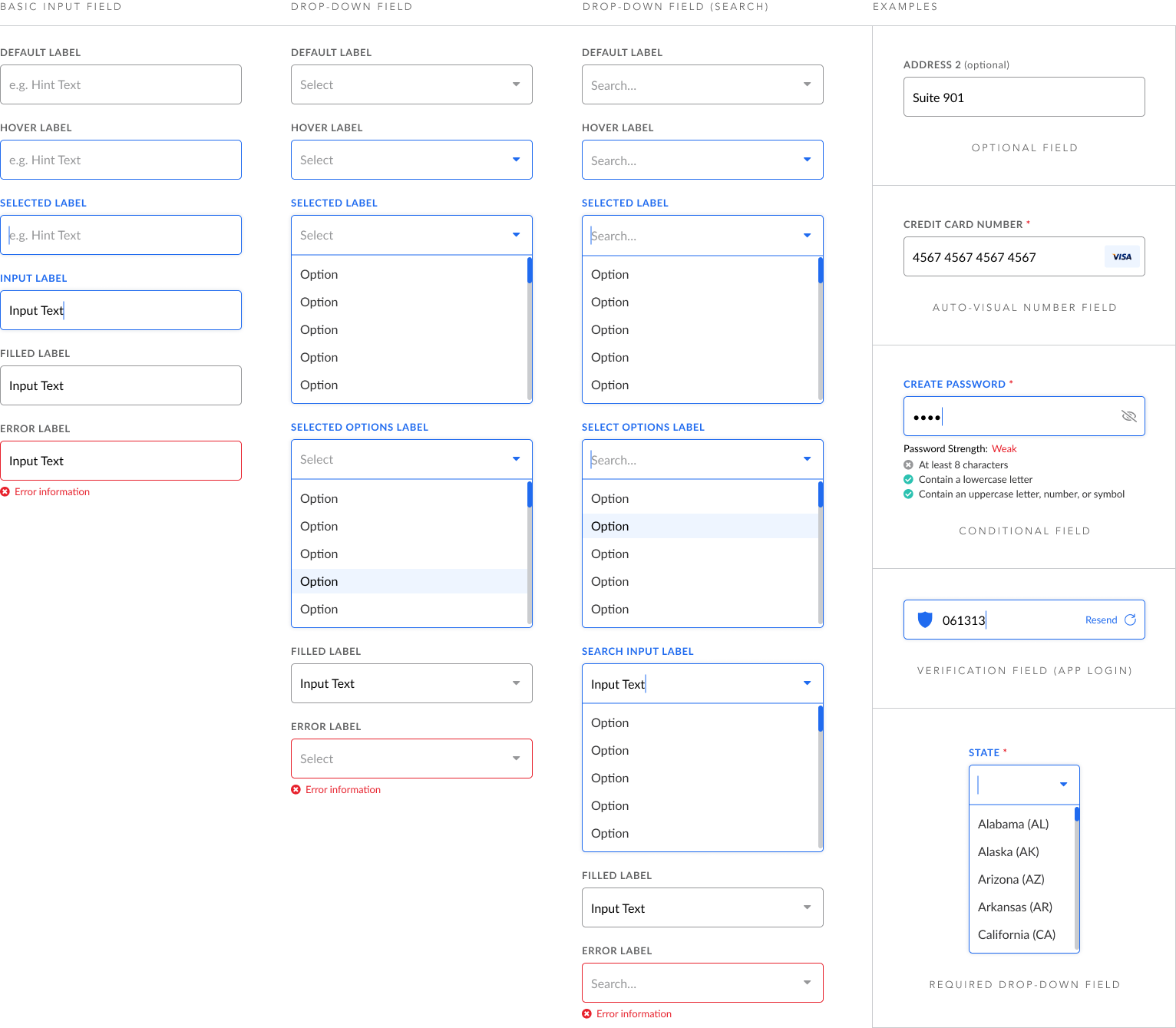
Our form fields are built off of 3 base components: Basic Input Fields, Drop-Down Fields, and Drop-Down Fields with Search. As with our button sizes, we based our form field size on Apple’s Human Interface Guidelines to make buttons and form fields optimal for touch screens.
Mobile App Components
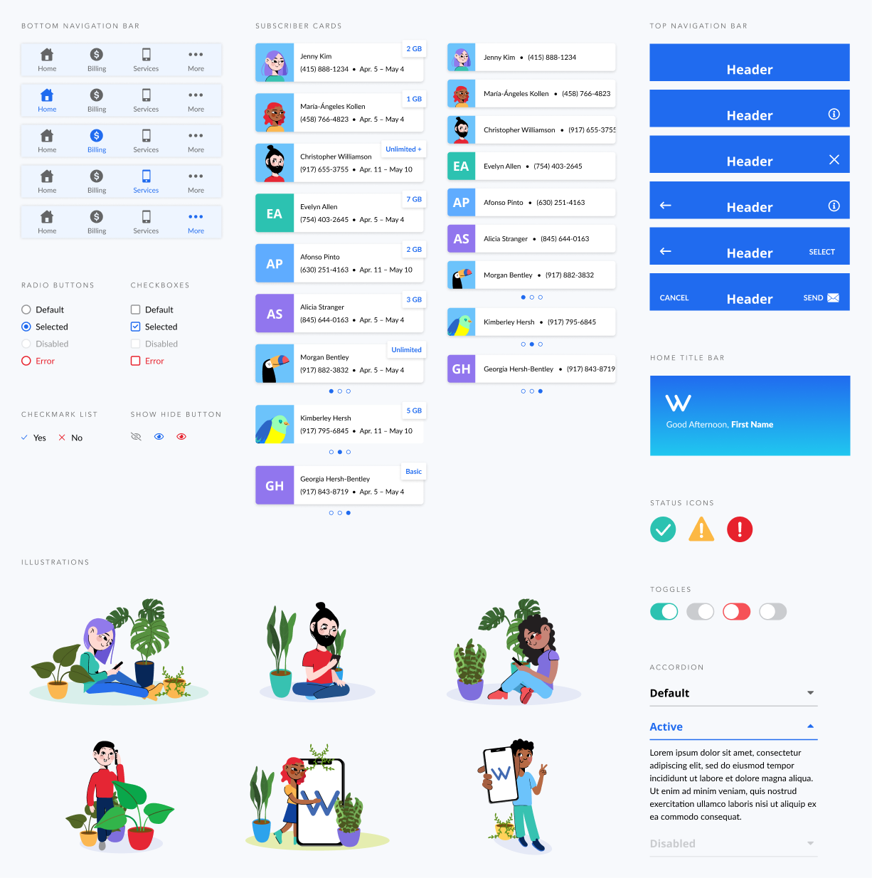
As I was primarily designing for iOS and Android, I created more of the mobile app components. The following is a sample of those multi-state components, including navigation bars, subscriber cards, UI selectors, and toggles. I worked closely with the web dashboard designer to ensure consistency with our components. Illustrations were created by our graphic designer.
Guidelines on use
- Home Title Bar — applies only to the app’s home screen
- Top Navigation Bar — applies to all app screens except the home screen
- Bottom Navigation Bar — applies to all app screens, with the exception of services involving checkout
- Subscriber Card — to communicate which subscriber they are viewing or selecting on app. Large size on home screen; small size on all other screens
- Radio Button — when user can make single selections only
- Checkbox — when user can make multiple selections
- Status Icons — to compliment success, warning, and error messages
Impact
50% increased efficiency
Using a design system, I found I was able to design from concept to final product 50% faster. I tested this with the Wing App project, where the Home design took ~1 month to complete with an “in-progress” system, while other app flows (Billing, Settings) took ~2 weeks to complete with more defined styles and reusable components.
80% average increased consistency
Evaluating cross-platform designs, I found an average of 80% similarity between the Home design on the mobile app and the web dashboard. I chose this as my sample as I worked closely with another designer to create similar experiences.
Accurately measuring for consistency was difficult, but my approach was to score the overall UI against each category of the design system—color, type, buttons, components, illustrations—and calculate the average.